


Is responsive web design necessary for my website?
With the advancement in technology, website arises with different requirements. Here, responsive web design has become an essential factor to drive the path of a successful website.
Are you aware of responsive web design and its importance?
If you are not familiar with these terms, let me explain them to you.
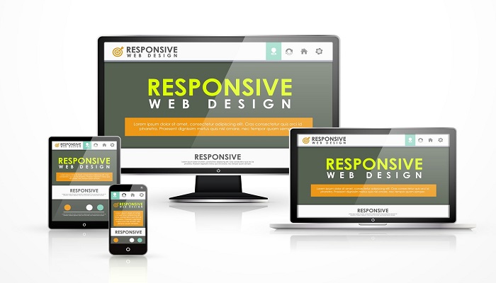
What is responsive web design?
Responsive website design lets the layout of the website change according to the screen size used to explore the website. A wide-screen display can get the website design with numerous columns of content as a small screen can have similar content offered in one column with text and links that are suitably sized to be read and used in that smaller display.
These days most clients are willing to update their website compatible with a mobile device. However, developing separate designs for different mobile devices can be a daunting process. Instead, developing the website with responsive features that go along with all the handheld devices is better.
When the user switches from their desktop device to other mobile devices, the website automatically switches to accommodate resolution, image size and scripting skills. Also, the web design should have the technology to reply automatically to answer the user’s preferences. This surely eliminates the requirement for various web design and development stages for all the new gadgets on the marketplace, providing your professional web design experience.
So, why responsive website design is a key feature that you can include in your web solution?
Let’s get into the importance of responsive web design:
Support multi-device user
We live in a world where different resolutions and devices are exploring our websites, but the same users come back to our website at a different time employing these various devices. This indicates, to support their experience, our website should work well on the device that is being used to visit.
Besides, the available content while browsing from one device should be present while returning on other devices to assure the consistency of details and the information they are looking for.
If users are browsing your website seeking a particular feature or information, they will surely visit again on the device comfortable for them. But, when they cannot find similar information on another device, they will not find your website reliable. There comes the risk of losing the customer. By ensuring the reliability of a website, carry out the best approach to support your customer and give them a reason to visit your website repeatedly.
On Site to rule them all
Maintaining a website is difficult, and trying to maintain a different website can be a really daunting task. This is where responsive web design comes to use, and you do not have to use different websites for desktop and mobile devices.
Usually known as a mobile compatible approach that detects your visitors’ type of device to get your business. This may be challenging for different reasons. Firstly, you have a couple of websites to keep updated, which indicates you are wasting your time and effort doing similar work two times.
Also, it would be beneficial if you utilize that effort in other works. Developing a responsive website is not that difficult as you can find lots of platforms, web design service providers that can unify all the management of the website and provide you complete control on the website display for various resolutions.
Enhanced search engine ranking
So, what is the main purpose of developing a website?
You want to make it popular among your customers, right?
Most search engines, including Google, love responsive web design as it supports various devices and screen sizes. And, Google has started to penalize the website, which is not responsive.
Google rewards a responsive website and has made it one of the essential SEO factors. So, to make your special place in the digital marketing world, you have to develop a website that favour all the screen sizes.
Future Scalability
Responsive web design comes up with lots of advantages, and one of its advantages is it provides you with the finest chance to support the new mobile device and screen in the upcoming days. A responsive website is fluids that scale up or down as required to best suit the screen being utilized to browse the website. This indicates that the new device booms the marketplace with screen size and is ready to meet all the devices in terms of design, experience and information.
Mobile usage is increasing
Based on the research, over 20% of Google searches are being carried out on some sort of mobile device. More than half of the local searches are performed by mobile devices.
When you start to notice the people around, you will see people busy with their mobile phones. Indeed, it looks that everyone is in love with their smartphone.
Due to some reason, maybe some companies have not realized the importance of mobile-friendly websites and followed the trend. But, if you are the one doing so, you sorely lag behind today’s trend.
Increase conversion rates
Apart from all the search advantages, responsive web design can boost the desired conversion rates from mobile users around the world.
Do you know why?
When the website does not work properly on mobile devices, users are expected to get away from the website to find the site suitable. These days, there are lots of customers who admire shopping from their handheld devices. Thus, when audiences have to complete the conversion, they will not waste their time on your website.
Besides, responsive web design works well with all the devices, and developers have complete control over how those conversion components are shown on mobile and tablets. Lastly, responsive website design facilitates you with some vital high-end heat-mapping and A/B testing, which can be accomplished with the available software.
Easy for social media marketing
You must be involved in inbound marketing.
If you are not, you may be familiar that blogging and social media has an important role in the present era. Actually, if you have not integrated some social media techniques into your marketing plan, you are surely missing one important part that will level up your business.
Have you realized the importance of mobile for social media users?
Based on the research, about 55 percentage of social media usage is carried out on mobile devices. This is important data as it describes sharing content on the different social networking websites, and if your website is not responsive, you cannot get the most out of your business. It won’t take time for users to get away from your website. This will consequence in a high bounce rate. So, to solve all these problems, make sure you develop responsive web design.
Stay ahead of today’s competitive world
In the business world, you have to develop all the techniques that will make you shine in the competition.
And, if maximum users are using mobile devices to look and buy online, you have to influence that customer to develop a mobile-compatible website. Actually, 85% of users think that mobile websites should be good and easy to explore.
If your competitors are not using a responsive website, then they lag behind you; take the advantage. This helps you to stay and shine in front of your customers, taking the customer away.
The final touch,
The days of building a website for a single computer screen are good and really over. Technology and the development of mobile websites force web designers to think again and again about how their work is displayed over multiple platforms.
So, stay updated with the recent trend and start developing a responsive website today. Any size you have, your website automatically fits the screen of all the devices shown on. Think about all the devices and the screen size; responsive website design is surely pleasing.